


What do genuine artists think of that much-appreciated staple of retro gaming, the classic game covers?
The 17th Century French artist Richarde de Pomme Pom, in his collected writings, Words About Paint, said that a piece of art should be, at the very least, more appealing to one’s eyes than a slice of lovely lemon cheesecake. If it wasn’t, he thought that one should eat the piece of art and go stare into the frontage of a pâtisserie instead.
When Richarde mastered his Triptych in Lemon series some years later, it left him without his appetite for cheesecake. Fearing for his grasp of fine food, he would never paint another pastry again. Nor even a potato. Life can be tough for painters, for them to communicate their thoughts, even though many have strong opinions.
One of my brothers, Joshua Bowe, is a professional artist, so I know this, and in the spirit of artistic opinion, I recently presented him with several retro game covers and hit record on his answers. First up, that classic Super Nintendo cover.
Street Fighter II

‘I don’t know where to begin’ Joshua says, having stared at the image for a little time and made various faces. ‘It’s terrible.’
‘Okay, well that’s that one done. Unless you have anything else?’
More faces.
‘Well alright then,’ he agrees and sits back. ‘Obviously, it’s all about a sense of animation, so Blanka is doing his roll attack and Chun Li is kicking. I don’t actually know what’s going on with Ryu. Look at his hand. But then look at the entire composition of him, and everything going on around him. The type face and Blanka’s hair are the same colour, so why overlap them? It honestly speaks like they couldn’t care less. I mean, what’s going on here-!?’ he points then at Blanka’s tuck’n’roll technique. ‘What is that?’
‘Is that a leg?’ I wonder.
‘I think it has to be his shoulder tucking into his legs.’
‘It shouldn’t need explaining.’
‘None of it makes any sense, though. Who exactly was this cover designed to appeal to? There were some good album covers around at this time, I don’t know why Capcom would have been happy with this. What is going on with Ryu?’
‘Shall we just mark that as bad and move on?’
‘There isn’t time to unpack what you’ve just showed me, so yes.’
Poor marks for Capcom there, and they really should have done better considering the artwork they were using for their home turf. Importers did really well off the back of that sort of thing.
Next, nothing short of Doom.
DOOM
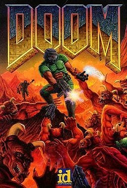
‘Is there any part of the game when it looks like that?’ Josh says of the PC mega-shooter cover, having given it a full glance and checked through what he remembered of the game on his PlayStation.
‘I don’t know,’ I respond. ‘I don’t think you see yourself in the third person, from what I can remember of it. I don’t know why that lower section of his armour is missing, either. But still, better than Street Fighter?’
‘Slightly. A better sense of design for who it is aimed at. The green stands out like a sore thumb, though.’
‘I think it is supposed to be blood,’ I suggest, squinting at the image. ‘But I don’t know why it’s the same green as his armour.’
‘Well, I don’t think they are trying to be sophisticated like that, which is fine, but is there any point in that game where it feels like that? If you took the title away it would never make me think Doom. And some minor leaning toward sophistication could have actually heightened the sense of violence. Just a little bit.’
‘And the typeface?’ I asked, hoping to circle around to a positive. ‘Like it?’
‘No. No, I don’t’
This wasn’t turning out to be the flying start that I had hoped. The biggest compliment so far had been to some unknown album covers of the time. Time to unleash Konami.
ISS Pro Evolution
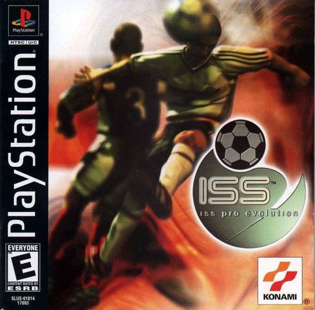
‘More interesting as an image,’ Josh says, and attention goes off in me like an exclamation from that other Konami franchise.
‘That’s saying something considering we’re looking at the same thing.’ I have always been fascinated by the covers that Konami saw fit to be front of house to their auspicious sports series. He was blowing my mind with this. ‘Go on,’ I ask.
‘Well, I think as an image it has potential. They’ve used a lot of darker colour to shut the focus down.’
‘Yes, lots of dark.’
‘But it’s drawing you to the foreshortened leg, and whoever did that knows it, so they kill off everything behind it. If you go back to the Doom image there’s detail crammed into every corner, but here it’s directed. It’s someone who knows not to overdo things. This one is probably going to be my favourite, whether or not it is a good piece of marketing.’
A surprise there for me, but surely the next choice was a shoo-in.
SEGA Rally Championship
Everyone loves Sega Rally top to tail, don’t they?

‘A massive appeal to movement again,’ he says of the title whose branding and livery are as fondly remembered as the game itself. ‘And it’s better compositionally than Street Fighter.’
There had to be a but coming.
‘I think Sega were taking a risk with this one. Very strong movement at an acute angle. I would say that they’d shared lots of data with Toyota to get to that point. It’s good but nothing more.’
Oh.
‘And the logo?’ I wonder. ‘It’s got a very Pro Rally feel to it.’
‘Yes, that’s fine. I personally don’t like a typeface to become a piece of art in itself, which is what’s happened here, but it’s fine.’
A speedy circuit of judgement from my brother there. We used to leave fresh ghost car records for each other on the Time Attack feature of the Saturn conversion back in 1996. There’s that magical year again. Good days but a middling response overall.
Let’s get back to the PC market for a final effort.
Syndicate Wars
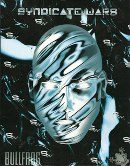
‘Looks very dated now, doesn’t it,’ are my brother’s first words to round us out. ‘Reminding me of… is it Thomas Dolby? Was he the musician?’
I pull an I dunno, guv face.
‘Well, some of his album covers had that feel to them.’
‘Johnny Mnemonic,’ I say to try and remain in the conversation. A pause.
‘I don’t remember this game,’ he says. ‘The image feels rushed, though.’
‘As in?’
‘Well you have these washy silver markings to detail the face, which is fine, but they don’t seem to have finished the faces’ relationship to the background. I can’t understand why you wouldn’t do that.’
‘And the typeface? And can I immediately say, Ghost in the Shell…?’
‘Yes it is, isn’t it. Also, quite at odds with the almost airbrush finish to the face. They share colours, but otherwise the geometry of the typeface isn’t sitting with the whole composition. I can see lots of ideas, but it doesn’t feel like a finished product. I don’t want to say lazy.’
‘Probably best not. I haven’t checked, but I think this game is still cherished.’
‘Well, the Pro Evo was best.’
‘Yeah, no one is going to be happy about that either. Plus, I think I used the North American cover for that. Very little of this went quite like I thought it would.’
‘You’re welcome. Do come again.’
Affiliate Disclosure: Some of the links in this post may be affiliate links, which means I may earn a small commission if you make a purchase through those links. This comes at no extra cost to you. Thank you for your support!
John is a former contributor with a collection of interesting retro gaming recollections.